This update includes spaces for all United States postage stamps issued since early March, plus last year’s federal “duck” stamp, which I somehow overlooked previously. Hopefully this will give you spaces for any recently issued stamps in your collection.
As always, if you have any questions or spot any errors, I would like to hear from you. Thank you for using The Philosateleian!
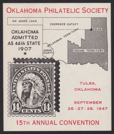
Oklahoma Philatelic Society sheet pictures 14¢ American Indian
It seems as though it has been quite some time since I added anything to my online exhibit of the 14¢ American Indian stamp, but earlier this week I was able to write up a newly acquired item in my collection, a 1947 souvenir sheet produced by the Oklahoma Philatelic Society.
1947 Oklahoma Philatelic Society souvenir sheet
Although I wasn’t able to find a great deal of information about the souvenir sheet itself, I did learn a few things that I didn’t previously know—for example, that the Oklahoma Panhandle despite being claimed by the United States was not part of any state or territory for nearly 40 years, and that the southwestern corner of Oklahoma was part of Texas until an 1896 United States Supreme Court ruling. That sort of stuff is one of the things that makes stamp collecting fun and educational at the same time.
In the process of getting this souvenir sheet ready to tuck away in my album, I discovered that I have no fewer than eight 14¢ American Indian covers and parcel fronts that I’ve never bothered researching and writing up. When I’ll get around to doing those, I don’t know, but it seems that I still have plenty of material to work through even if I buy nothing else!
San Antonio Philatelic Association cancels June meetings
The San Antonio Philatelic Association has not held a meeting since mid-March, and the club won’t be meeting again any earlier than July after announcing that all meetings for June 2020 have been cancelled.
According to SAPA Treasurer Fred Groth, MacArthur Park Lutheran Church (where the club meets) has not yet reopened due to concerns over COVID-19, and no decisions regarding reopening are expected before the church council meets in mid-June.
“We can only hope that the church council will establish a timetable for resuming its activities,” Groth wrote in an email to SAPA members late last week.
Due to my own commitments, I’m only able to make it to meetings during the summer months, so I’m hopeful the club will be able to resume meetings in time for me to make it to one or two. For now, however, we’ll await further developments.
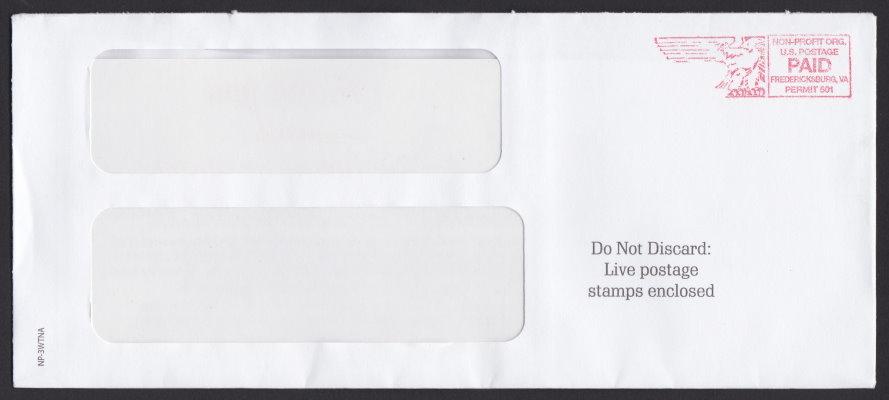
Although envelopes with any sort of stamp—even the ubiquitous non-profit star on virtually every piece of mail that non-profit organizations that even bother with stamps use on their mailings—catch my eye, those with postage paid imprints are typically of little interest. I thought that was the case with an envelope I received in the mail this week, and it would be except for one tiny bit of text on the front of the cover.
“Do Not Discard: Live postage stamps enclosed.”
National Police Association “Live postage stamps” cover
Granted, postage stamps are many wonderful things: miniature works of art, windows to faraway places, pieces of history. But “live”? I’d never before thought of them in quite that way.
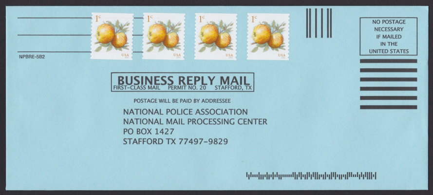
It turns out that in the printing and direct mail industry, a “live stamp” is a real postage stamp, not just a meter impression or business reply envelope with no postage attached.1 In the case of this mailing, the enclosed BRE bears several copies of the current 1¢ apples definitive—in other words, “live” postage.
National Police Association business reply envelope
Much as I enjoy stamp collecting, I still think it’s a funny turn of phrase to apply to a non-living thing.
Still, all things considered, I would much rather receive live stamps than dead ones.
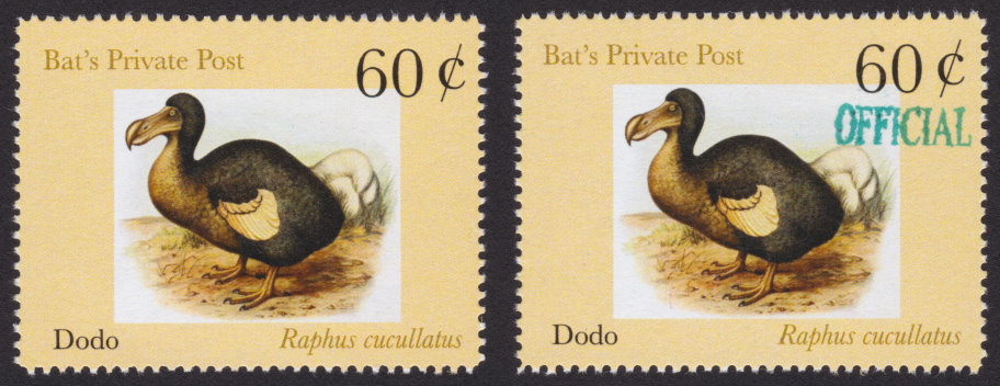
When I checked my post office box following the extended Memorial Day weekend, I found an unexpected treat inside, a first day cover from Bat’s Private Post in Beverly Hills, California. On the front of the cover and enclosed inside were pairs of 60¢ Dodo stamps issued on May 23.
Bat’s Private Post Dodo stamps
As you can see, one of the stamps is a standard issue, while the other bears an “OFFICIAL” handstamp in green.
According to a press release included with the stamps, the image of the dodo is taken from a 1907 painting by Frederick William Frohawk. The stamp, which is the first in a planned series featuring extinct birds of the Mascarene Islands, pays local postage on letters weighing up to one ounce.
The cover was postmarked in Beverly Hills on May 23, and I received it on May 26. Considering that May 24 was a Sunday, and May 25 was a holiday, I’d say that’s pretty speedy delivery on the part of the USPS!
For more information about Bat’s Private Post’s new dodo stamps, write to:
Bat’s Private Post
PO Box 11175
Beverly Hills CA 90213-4175
United States of America