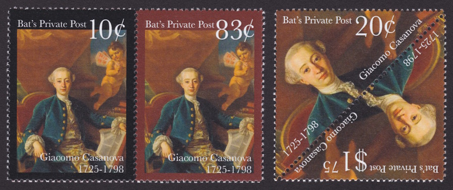
The newest local post stamps from Beverly Hills-based Bat’s Private Post celebrate the 300th anniversary of the birth of Italian adventurer Giacomo Casanova (1725–1798).
The designs of the 10¢, 20¢, 83¢, and $1.75 stamps, all of which were issued April 2, 2025, are based on a portrait credited to Francesco Narici.
Bat’s Private Post 10¢, 20¢, 83¢, and $1.75 Giacomo Casanova stamps
Today, Casanova’s name is synonymous with that of a playboy due to his many amorous exploits during his lifetime, but his lasting claim to fame is an autobiography detailing customs and norms of 18th-century European social life.
According to a release included with the stamps, the 10¢ value pays the Bat’s Private Post fee to carry a letter to a United States Postal Service facility, while the 83¢ value covers the cost of local transport plus domestic postage (which Bat’s Private Post pays). The 20¢ stamp pays either Bat’s Private Post’s parcel fee or its fee to carry a letter to the Servicio Postal Mexicano, and the $1.75 stamp covers the cost of local transport plus US postage to international destinations.
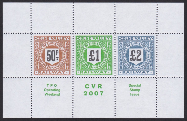
Cinderellas promote heritage railway, Penny Black anniversary
Today, I want to share images of stamps I received in the mail last week from two correspondents of mine. One of the sets could, I suppose, perhaps qualify as local post stamps, while the stamps in the other set are strictly cinderellas, but they’re all pretty neat.
The first item is a souvenir sheet for Colne Valley Railway, which describes itself as a “heritage steam & diesel railway in Essex” and operates a full-size steam locomotive and post office car and has other miniature an model trains on display.
This souvenir sheet, which contains 50p, £1, and £2 stamps, was printed by Alan B. of Adanaland fame for a fundraiser in 2007.
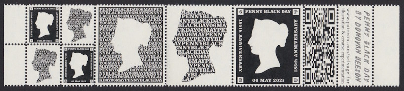
The other cinderella stamps of note came from Donovan B., formerly of the Letter Writers Alliance, and celebrate the 185th anniversary of the Penny Black.
Penny Black Day 185th Anniversary cinderella stamps
As you can see, Donovan produced these stamps in two different sizes in the same block. I’m not sure if she removed pins from her perforator to achieve this layout, or if she fed only the left edge of the sheet under the perforating pins, but the result is really slick in either case.
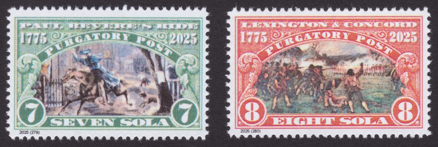
Purgatory Post commemorates Paul Revere, Lexington & Concord
New Hampshire-based Purgatory Post last month issued a pair of stamps in its ongoing series commemorating important events of the American Revolution.
On April 18, Purgatory Post released a 7-sola stamp commemorating Paul Revere’s famous ride from Boston to Lexington to warn other American colonists of British troop movements in the area.
Purgatory Post 7-sola Paul Revere’s Ride & 8-sola Lexington & Concord stamps
On April 19, an 8-sola stamp was issued to commemorate the Battles of Lexington & Concord in which “minutemen” faced off against British forces who were on a mission to seize weapons and ammunition. The skirmishes were the first battles of the Revolutionary War.
The frames of both of Purgatory Post’s new stamps are modeled after the design of the Sesquicentennial Exposition stamp the United States issued in 1926.
April 21 new issues from Bat’s Private Post, Como Park Post
I’ve spent far too much of the past week and a half wrestling with one lawnmower and pushing another, which has put me behind on some blogging, but let’s take a quick look at new issues from a couple of private local posts.
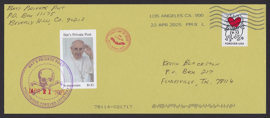
First is an April 21 release from Bat’s Private Post in Beverly Hills, California. The 83¢ stamp commemorates Pope Francis, who died the same day the stamp was issued.
Bat’s Private Post 83¢ Pope Francis stamp on postcard
Back in 2022, Bat’s Private Post issued a commemorative stamp the same day Queen Elizabeth II died. I’m not aware of any other postal operation, official or private, that releases memorial stamps quite so quickly!
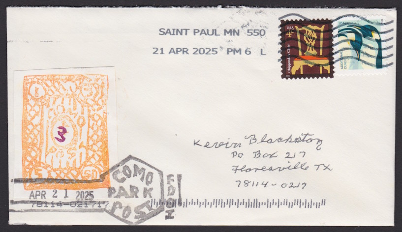
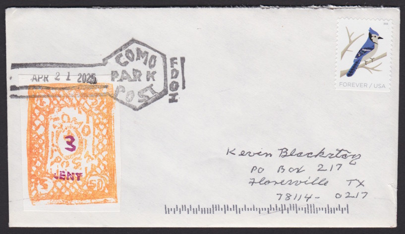
Coincidentally, Como Park Post in Saint Paul, Minnesota, released a new stamp the same day as Bat’s Private Post’s Pope Francis stamp. The design of Como Park Post’s stamp was carved by hand.
Como Park Post 3¢ stamp on coverComo Park Post 3¢ stamp on cover
As you can see, I’ve received a couple of different varieties of the new stamp, one bearing just the numeral “3” and another reading “3 CENT.” Como Park Post operator Tom B. informs me that various types of a die reading “3¢” will also be used, and that the base design will also appear with a 5¢ denomination.
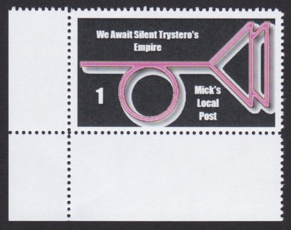
The latest new stamp from Mick’s Local Post in Oregon pays homage to Thomas Pynchon’s The Crying of Lot 49.
According to a release included with the copy of the stamp I received, the “1” on the stamp indicates it is intended for local use.
Purgatory Post Harriet E. Wilson stamps
The Crying of Lot 49, which was released in 1966, tells the story of a woman who unearths evidence of a feud between Thurn-und-Taxis Post (a real postal service that operated in Europe from 1806 to 1867) and a competitor known as Trystero or Tristero, which was driven underground by the better known operation. The protagonist suspects Trystero developed into a secret society. Wikipedia says it’s “both an ‘exemplary postmodern text’ and a parody of postmodernism” with plenty of cultural references that would have been widely understood at the time.
While I’ve never read the book myself, the title apparently refers to the auction of a collection of rare local post stamps—an interesting topic to be included in a book intended for general consumption!