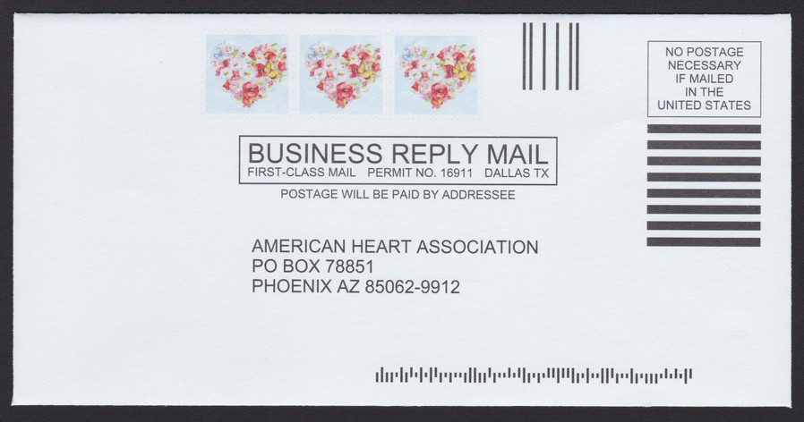
American Heart Association envelope features floral hearts
I wrote only last month of the latest business reply envelope I’d received in an American Heart Association mailing, but there’s already a new variety to report from that organization. The front of the latest, which showed up in my mailbox last week, bears three preprinted copies of a heart-shaped floral arrangement.
American Heart Association business reply envelope with stamp-sized designs picturing floral hearts
Each of the designs is surrounded by a printed simulated die cutting. The printing is a light gray that does not show up well in the image presented here.
It’s interesting to see a new BRE design from a charitable organization so soon after receiving a different design. Some other nonprofits appear to be reusing designs across multiple mailings.
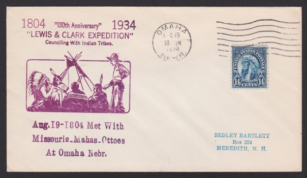
This month, I’m excited to share another cover commemorating the 130th anniversary of the Lewis and Clark Expedition. This envelope was postmarked in Omaha, Nebraska, in August 1934.
14¢ American Indian cover with Lewis & Clark Expedition/Omaha, Nebraska, cachet
Like the cover I posted previously, this one is addressed to a collector in Meredith, New Hampshire. I don’t know if he commissioned the cachets himself or if he was merely a subscriber, but for the sake of my 14¢ American Indian collection, I’m glad he preserved these philatelic solo uses of the stamp for our enjoyment.
The first couple of months of 2023 are now in the rearview mirror, and there are new United States stamps that our albums need to accommodate as they begin showing up on incoming mail. With that in mind, I’m pleased to announce the release of the Spring 2023 Supplement (263 KB, 4 files, 8 pages) for The Philosateleian U.S. Stamp Album. This update includes spaces for all new United States stamps issued through the beginning of March, and it is ready for you to download and print at your convenience.
I hope you’ll let me me know if you have any comments or questions. Thank you for using The Philosateleian!
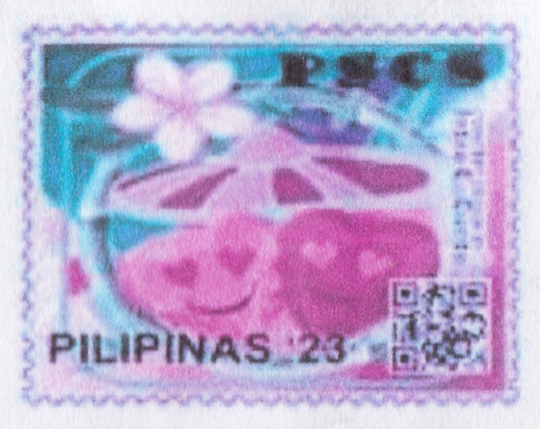
PSCS Local Post celebrates love with pair of hearts
The latest mailing I received from San Diego Local Post operator Renato L. had one of Renato’s own local post stamps on the front, but some additional material that I had not previously seen on the back: several copies of a PSCS cinderella stamp picturing a pair of smiling hearts.
The design is bordered by simulated printed perforations.
PSCS stamp picturing pair of hearts
I have not yet received official word on whether these are official issues of PSCS Local Post, or simply decorative seals, but I suspect they are the former. In any case, it’s another item to watch for on your incoming mail.
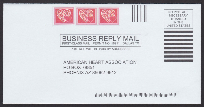
American Heart Association envelope features hearts
An American Heart Association fundraising mailing earlier this month contained a colorful business reply envelope with faux postage designs printed on it.
The smaller-than-business size envelope has three copies of a landscape-orinted pink-and-white design picturing a small heart superimposed over a large heart—an appropriate design, considering the sender.
American Heart Association business reply envelope with stamp-sized designs picturing heart
Most such designs I’ve seen printed on business reply envelopes use a more typical portrait orientation, so this BRE stood out a little bit to me.