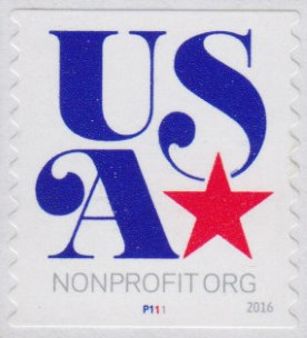
New nonprofit stamp showing up on solicitations
If you’re on any charities’ mailing lists, you may have already seen a new stamp used on their soliciations. If you haven’t, you probably you will soon since a new stamp for nonprofit mailings went on sale in April. The simple design features the letters “USA” in blue, and a star in red.

What do you think of it? My own feelings are mixed. It’s nice to see something new since it has been over five years since the ubiquitous art deco bird stamp was released, and I do favor the new design more than the old one. Although it’s very much text-based, it’s less displeasing than last year’s “From Me to You” stamp; I think the presence of the star and the curls on the tips of the letters help in that regard.
On the other hand, I kind of feel like we’re missing the opportunity for something more creative. For example, the simple “American Scenes” nonprofit stamps used before the art deco bird were in my opinion more visually interesting.

We can only hope that the USPS in the future might return to that sort of approach for its nonprofit stamps.
Published 2016-06-12
Comments
Log in or leave an anonymous comment.