On stamp design
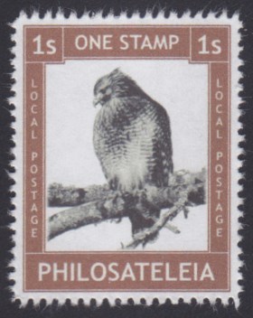
When I begin sticking copies of Philosateleian Post’s new red-shouldered hawk stamp on my outgoing mail next month, it will be the 25th different local post stamp I have used since designing my first one back in 2004.
While I don’t consider myself to be an artist, my design skills have improved immensely over the years—and more importantly, I’ve developed an understanding of some things that do and don’t work. Here are a few tips to keep in mind when you’re designing your next local post stamp, artistamp, or cinderella.
Design at 300 DPI (or higher)
I designed my earliest Philosateleian Post stamps in Paint for Windows. It’s a solid little program, but anything you create with it is stuck at 96 DPI. Dots per inch refers to the number of dots that can be printed in a one-inch line; a higher DPI setting means a smoother looking print, while a lower resolution means what you print will be coarser or more grainy in appearance. If you’re printing anything remotely resembling a photo at a low DPI setting, it’s going to look rough.
A host of other graphics programs do allow you to change that setting, from Photoshop to the popular (and free!) Paint.NET. Before you paint the first pixel of your next masterpiece, make sure the file is set to print at 300 dpi or higher.
(This assumes, of course, that you’re creating bitmap images. If you’re creating vector image files, then this is not an issue.)
Keep it simple
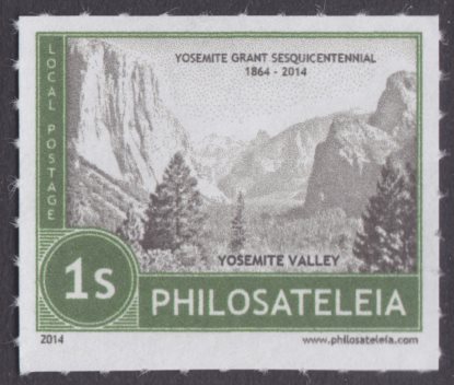
Last year, I was determined to commemorate the 150th anniversary of the Yosemite Grant, which set aside part of what is now Yosemite National Park for preservation. My wife and I visited Yosemite in 2013, and I took the same absolutely gorgeous photo that innumerable other visitors have taken: a panoramic shot of Yosemite Valley from Tunnel View. That photo would be the basis of my stamp.
I carefully designed an appropriate frame, resized the photo to fit within the frame, and printed out a proof copy.
It was ugly.
What I’d failed to keep in mind was that the most beautiful photo in the world, when resized to fit on a postage stamp, can become a muddy mess. Add to that the limitations of consumer-grade inkjet and laser printers, and the odds of a clear reproduction get even worse. The same thing goes for any design, even if it’s not a photo: if it’s overly complicated, getting a clear print is going to be challenging. Do you really want recipients of your stamp to have trouble figuring out what it pictures?
I was able to salvage my idea by applying some effects to the photo, including turning it into a black and white design, and ended up with one of my all-time favorite Philosateleian stamps:

So there are ways around it, but save yourself some frustration. Before you spend hours on a design, take your rough idea, whether it’s a photo or something computer-generated, and print it at stamp size. You may find you need to go back to the drawing board, or even take another approach altogether.
Avoid very small text, and (sometimes) light text on a dark background
If you’re printing from engraved plates, or even using professional quality printing presses, you can get away with tiny lettering on your stamp. For the rest of us, avoiding extremely small lettering is the way to go when designing cinderella stamps because everyday inkjet and laser printers simply can’t produce clear text if it’s below a certain size. Go below that threshold, and you’ll be lucky if you can read the text at all.
If you intend to use white or light text on a dark background, it becomes even more important to use a bigger font. If the text on your stamp is large enough, and the letters are sufficiently bold, you can get some nice results:

But even the “local postage” labels on the sides of this stamp are flirting with the limits of clarity, and that’s using a bold 14-point font!
Again, before you spend a lot of time making sure everything is just so, try printing your design-in-progess. It’s better to find out early that you need to bump your font size up a notch or two than to need to rework your design later.
Aim for perfection, then move along
You can spend a lot of time turning your idea into a local post stamp or artistamp, and I think you should get it as close to perfect as you can. I don’t know how many hours I’ve put into some of my designs, adjusting and tweaking and sometimes starting over altogether.
At the same time, at some point you have to move along.
I’m not saying you should just slap things together haphazardly and without forethought. Creating a nice stamp design can take time, and I want Philosateleia’s stamps to look as good as or better than real stamps. I think that’s a worthwhile goal for anyone designing local post stamps.
The fact is, however, that you’re not likely to achieve stamp design perfection. When I look back at some of my earliest issues, I have to laugh a little bit at the primitiveness and the absolute lack of perfection. Even designing those stamps, though, taught me things, some of which I’ve shared in this post. With regards to stamp design, it is the pursuit of perfection, not the achievement, that is important. Do the best you can, and then unleash your stamps on the world.
Published 2015-06-02
Comments
Log in or leave an anonymous comment.