Fundraising cover’s use of braille feels effective
Following a week of what was for San Antonio miserably wintry weather, I was able on Friday afternoon to venture over to the post office to check my box there, and was quite interested to find a fundraising mailing from the International Eye Foundation.
Nonprofit mailings in general are not all that noteworthy from a philatelic point of view, but this particular cover caught my attention because of the braille embossed on the cover’s front below the space reserved for the patriotic star stamp.
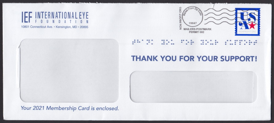
I can’t argue that this isn’t something of a gimmick, but it’s a neat gimmick, and I think an effective way of drawing attention to what might otherwise be immediately tossed into the waste bin as junk mail.
Whether or not the embossing has a positive effect on the IEF’s response rate, I have no idea, but kudos to the marketing person who came up with the idea.
Published 2021-02-21
Comments
Log in or leave an anonymous comment.